The mark: an A with a fold.
Arvion needed a mark that could stand on its own at 16 pixels and still feel considered at two metres. Prism A is one letter cut into two folded planes: the left plane takes the light, the right plane falls away, and a single notch keeps the letter readable.
The seam is the ownable part. It reads as a built object rather than a drawn symbol, it survives flat printing, and it carries the idea we sell: two disciplines, design and engineering, folded into one product.

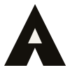
What ships
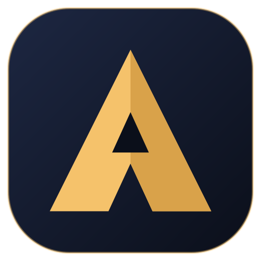 App icon / avatar
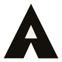 Monochrome
Clear space
Keep free space equal to the width of the A's left leg (about 18% of the mark height) on every side. Nothing enters that square: no text, no border, no other logo.
Minimum size
24 px / 8 mm for the monogram, 96 px / 28 mm for the horizontal lockup. Below that, use the app icon instead of the wordmark.
Do not
Do not outline it, add a gradient, rotate it, place it on a busy photograph, or rebuild the wordmark in another typeface. The mark is gold, white or black; that is the whole palette.
Tokens
#0B0F1A#121826#F5C26B#3A7BFF#F7F3EA#B23A2BGold on night is the house accent (contrast 7.6:1). Product themes swap the accent but keep the same structure, which is why the gallery looks like one studio with range rather than thirty products with thirty brands.
Typography
Headings and numerals. SemiBold and Bold only, tight tracking (-0.02em) above 24 px.
Body, UI and tables. 400/500 for text, 600 for labels, tabular numerals in dashboards.
Five directions we considered
Prism A
Two folded planes and a notch. Chosen: depth, a distinctive seam, survives 16 px.
Peak A
Mountain counter with a sun. Distinct, but flatter and more literal.
Arrow A
A as an arrowhead. Energetic, but arrow marks are everywhere in software.
Orbit A
A inside a ring with a node. Elegant, but circular letter marks are crowded.
Signature A
The right leg sweeps into a signature line. Memorable, hard at small sizes.